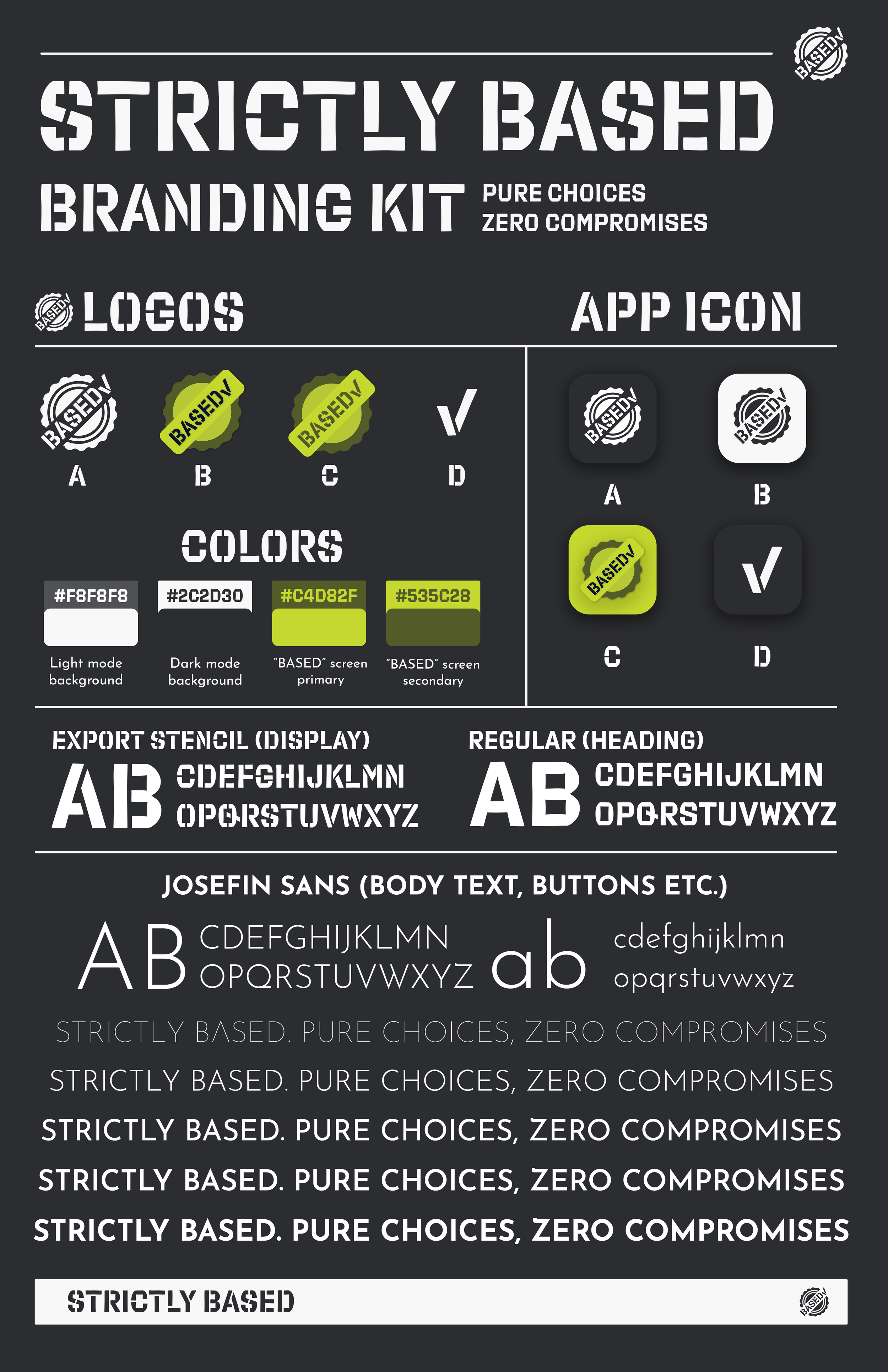
UI & Branding
Identity for a health startup
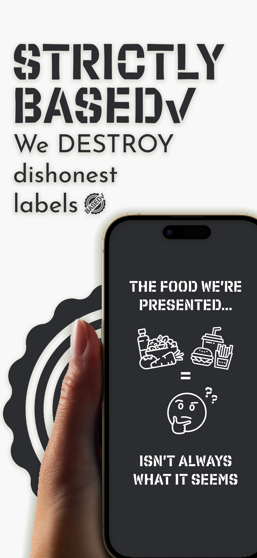
Strictly Based helps you make better health decisions around food. I was tasked to create clean, minimalist branding that helped communicate their brand story, & contribute to their web and app experiences.
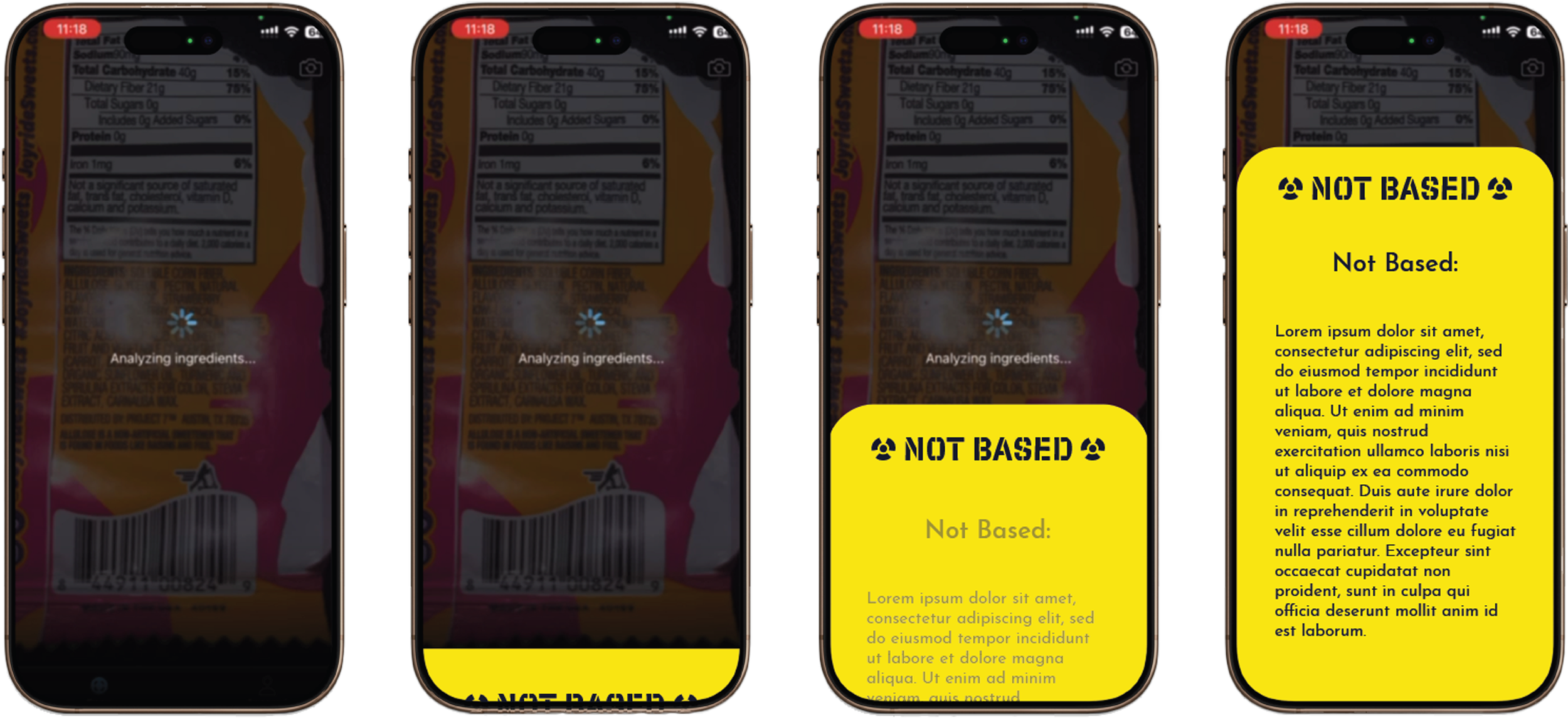
App Function:
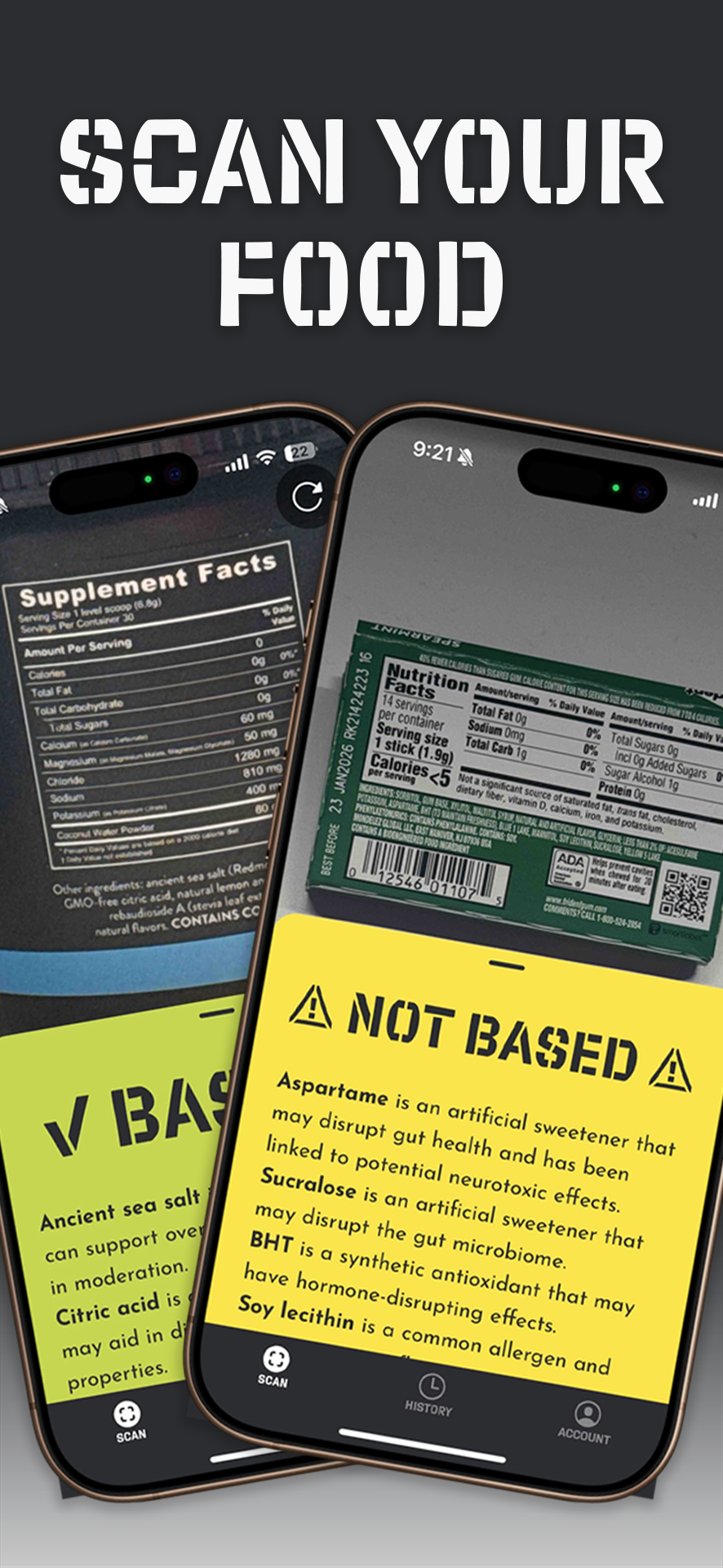
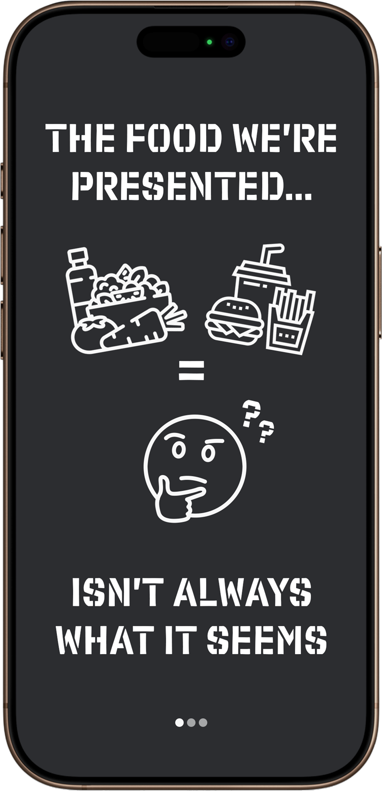
Use computer vision & ChatGPT API to scan ingredient labels on any product (food, cosmetics, pet food)
Deliver a verdict judging health value of product + explanation.
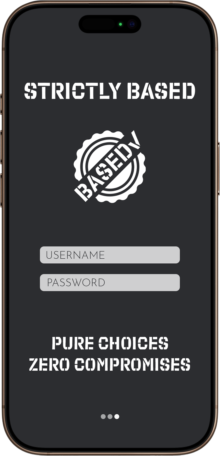
BASED: Contains no gmo, additive, synthetic component, or chemical proven to have a negative health outcome
Not Based: Contains harmful ingredients
Concept: Stamp of approval motif, playful & minimalist, inspired by CalAi and other Ai app startups in the space.


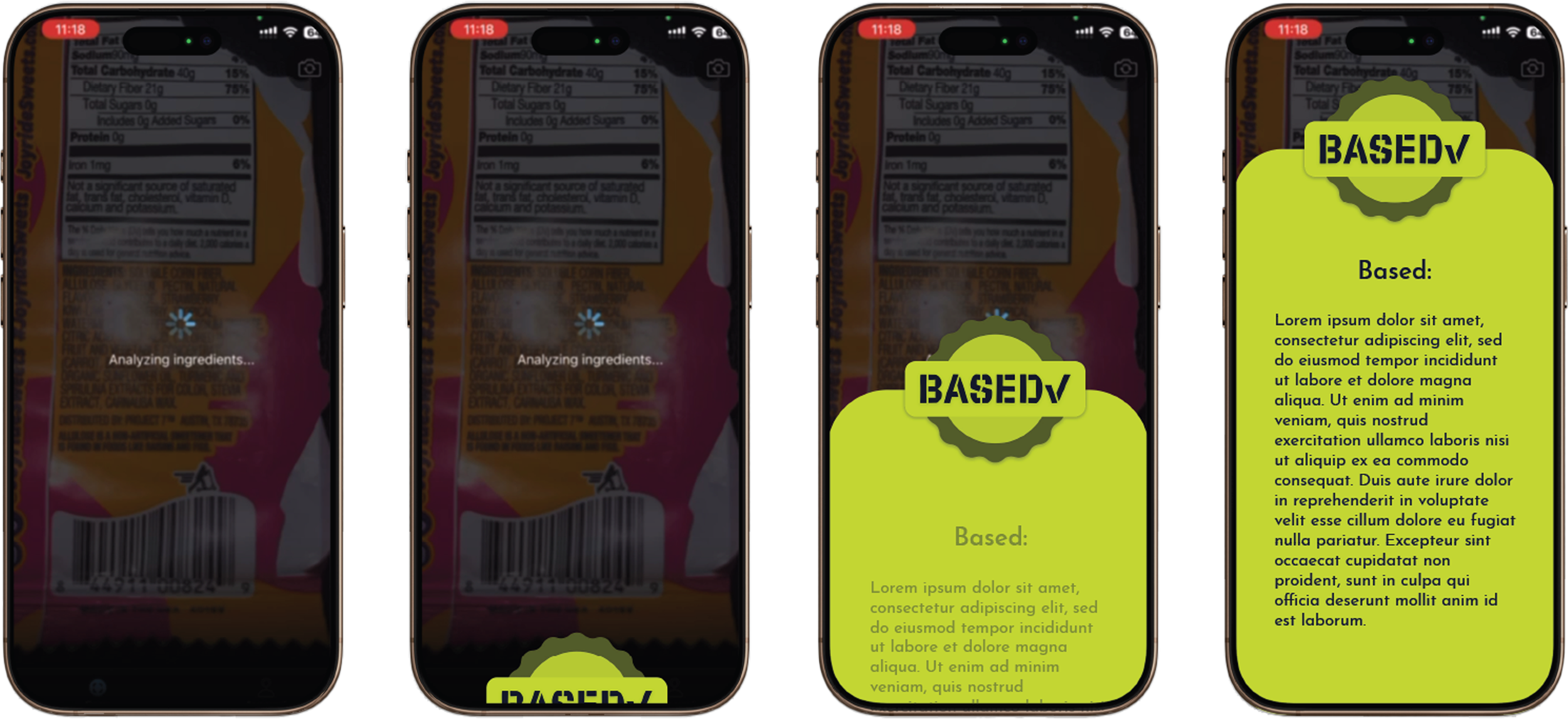
I mocked up and demo’ed tutorial onboarding screens, reactions & animations. I worked closely with the dev team to produce a functional & beautiful final product, published in the app store.
BASED Interaction

NOT BASED Interaction
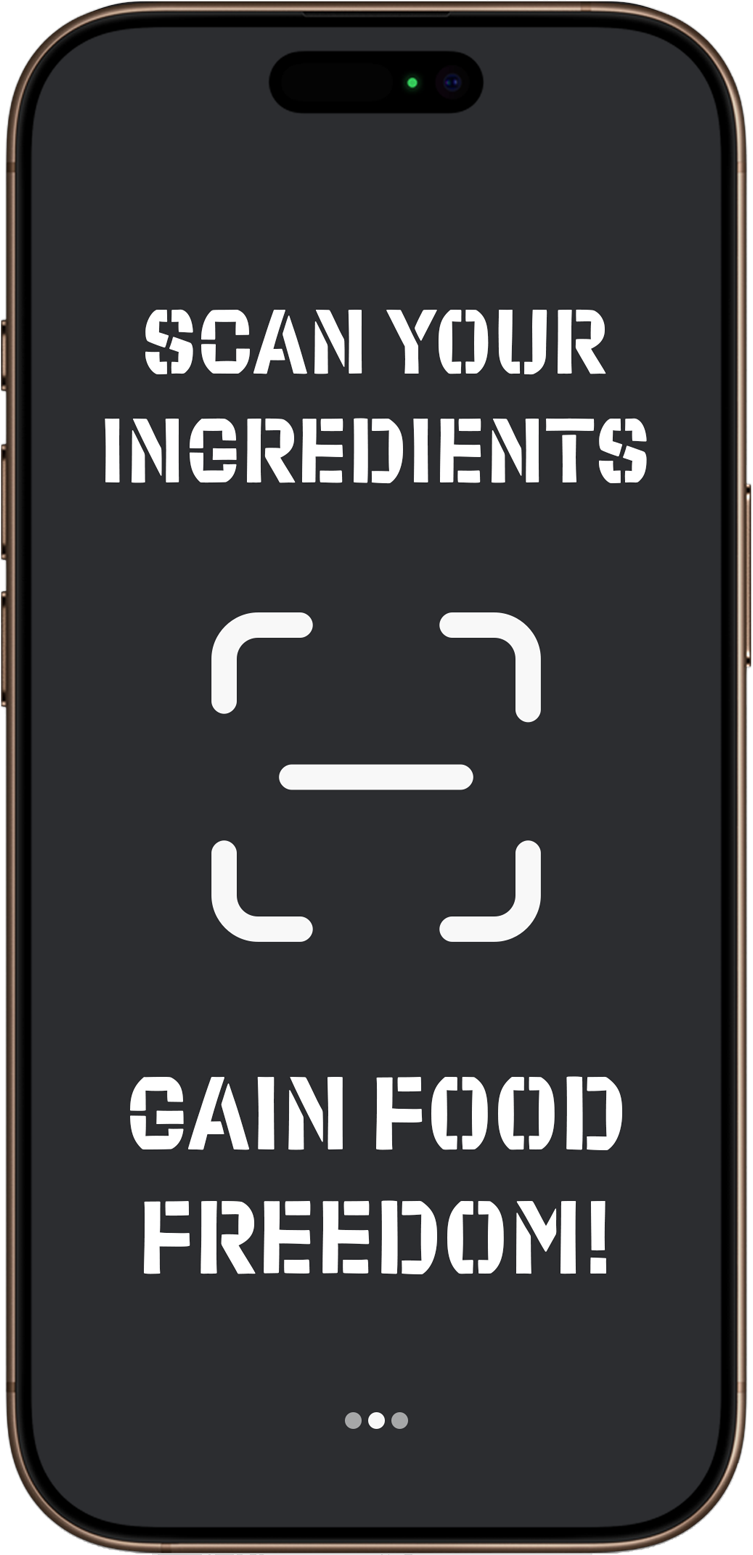
Onboarding Screens
Striclybased V1 Demo
On V1 of the app, many of the initial design concepts were implemented & prototyped, however certain items needed to be iterated and improved.
Based/Not Based screens changed from the initial concept
Due to code complications, it was more efficient and straightforward to simplify the early interaction designs.
Implementation of secondary font
for the MVP, issues arose with using the secondary font, Josefin sans, so later versions have it instead.
User experience
Certain animations were sticky during the mvp, lags and inconsistencies popped up when testing.
Navigation was improved upon after the mvp, user interviews helped in this process.
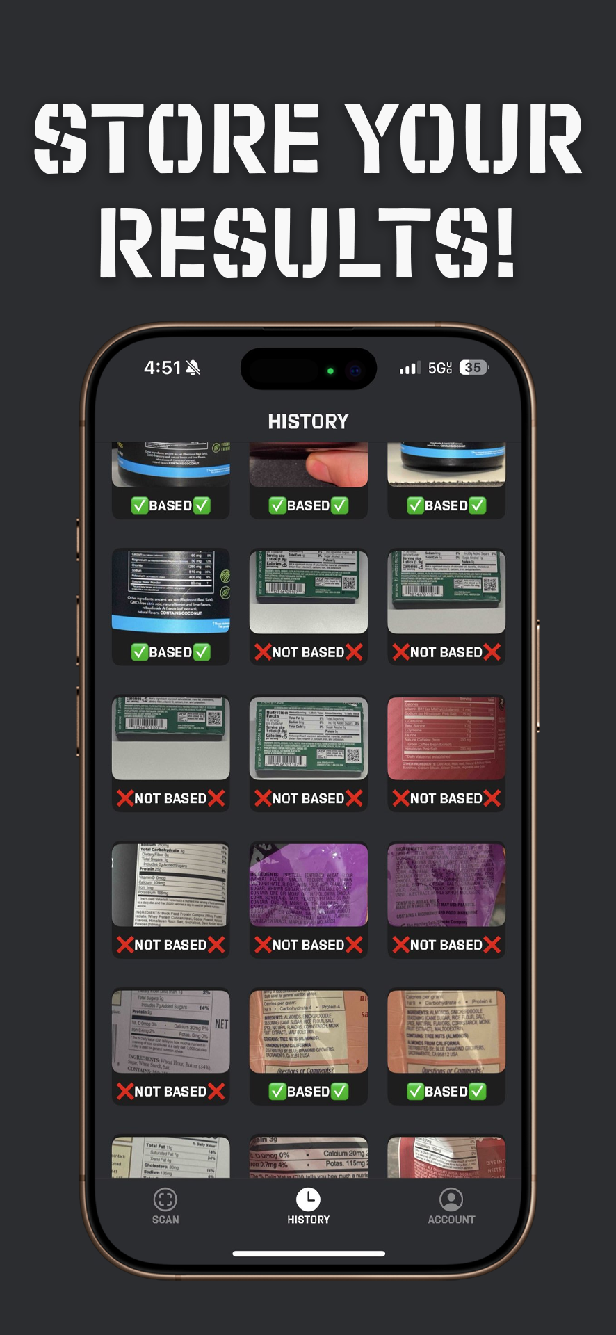
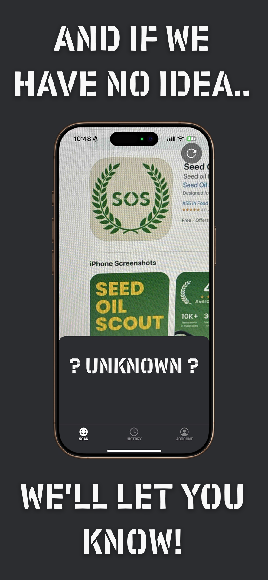
App Store Promo Images