Seydrah By Fouda
Process in branding for a fragrance startup…
determine brand archetype
Develop brand lore
Decide visual identity, cues & motifs
Prototype physical product & branding
Execute marketing & product
Background
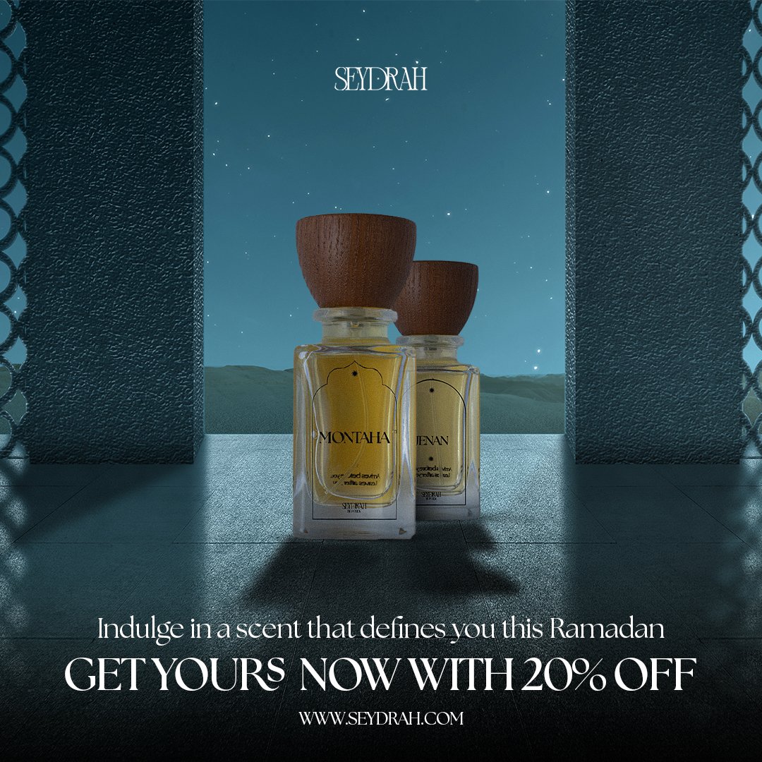
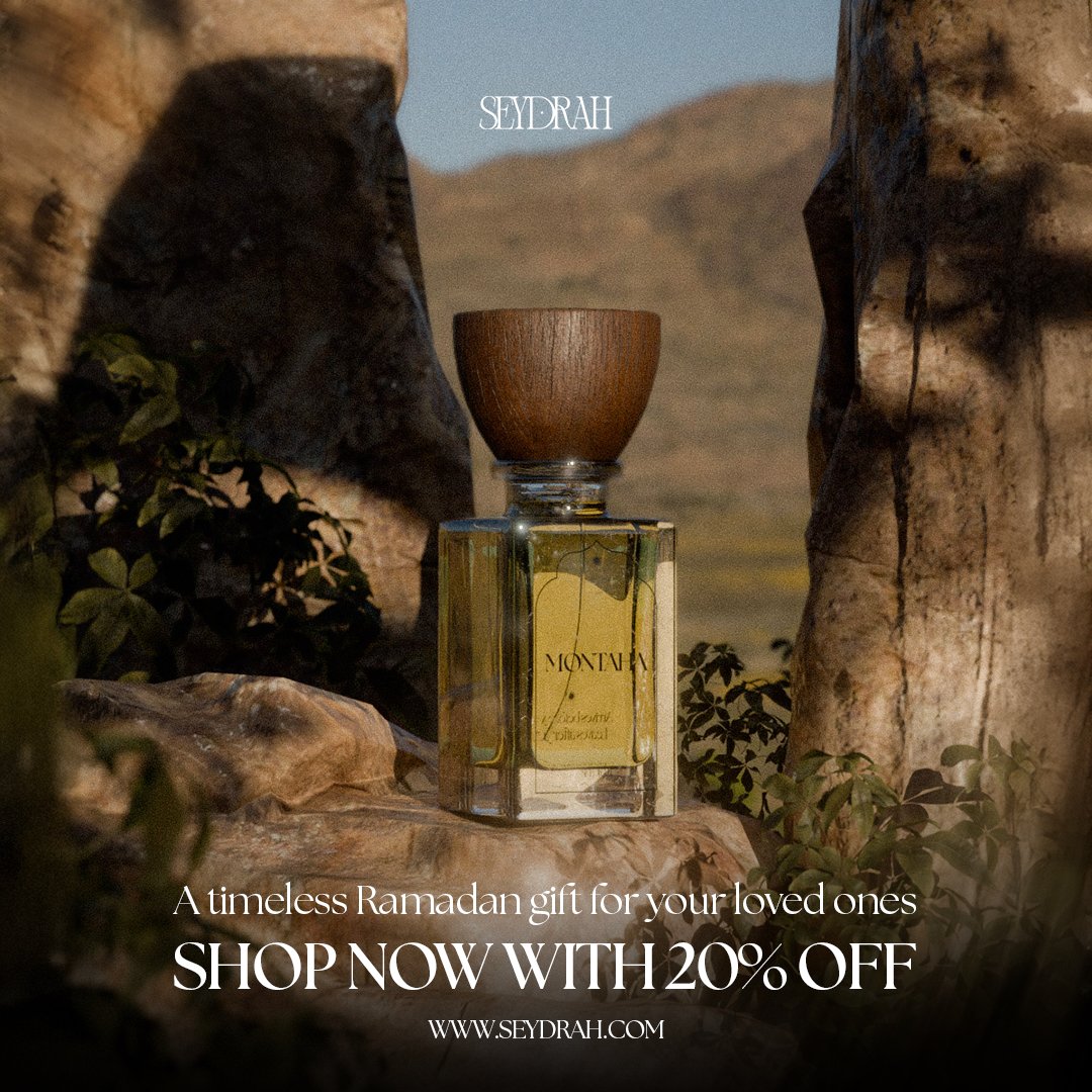
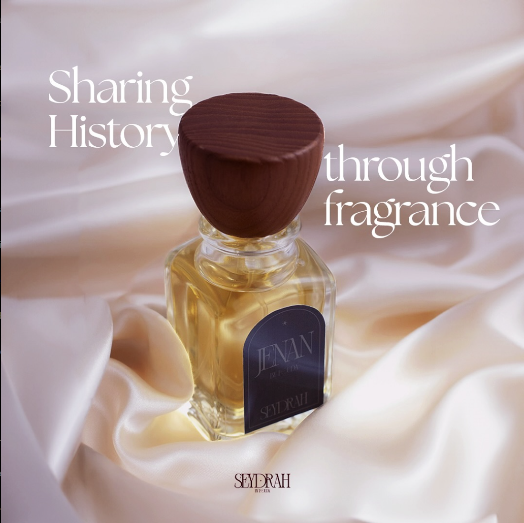
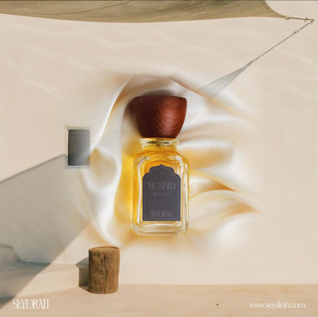
I got in touch with Seydrah to develop an identity around their concept: reviving & honoring arabian fragrance tradition through a modern lense. The name seydrah is a reference to the Islamic Sidrat al-Muntaha (سِدْرَةُ الْمُنْتَهَىٰ), a sacred heavenly tree, Islamic, Arabian, and Natural motifs are all central to the expression of these products.
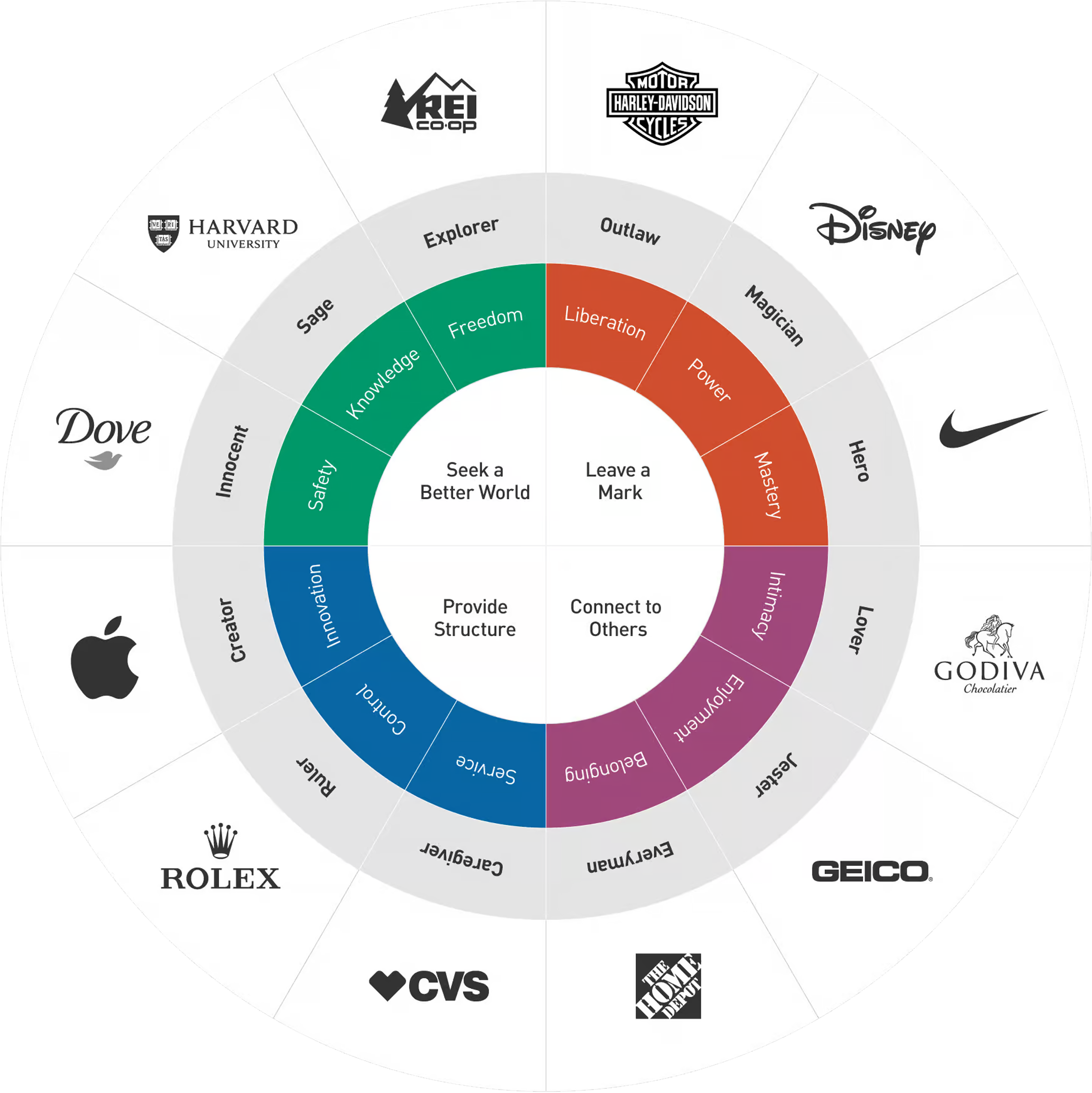
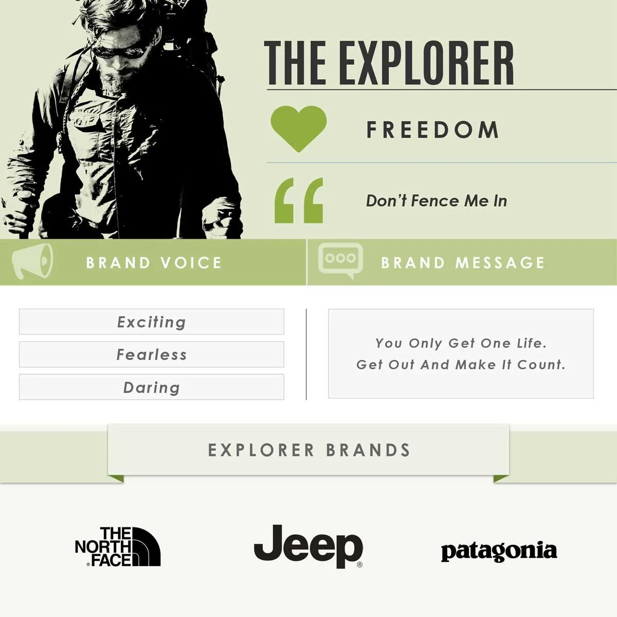
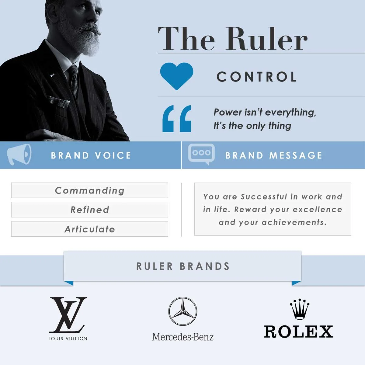
Framing through archetypes…
The early stages were done with the founding team, who wanted to channel exploration & power, using archetypes as a base for brand story.
The Explorer helped inform our positioning as a daring, nature inspired newcomer.
The Ruler helped inform our positioning as a luxurious symbol of status.
Colors & Visual References
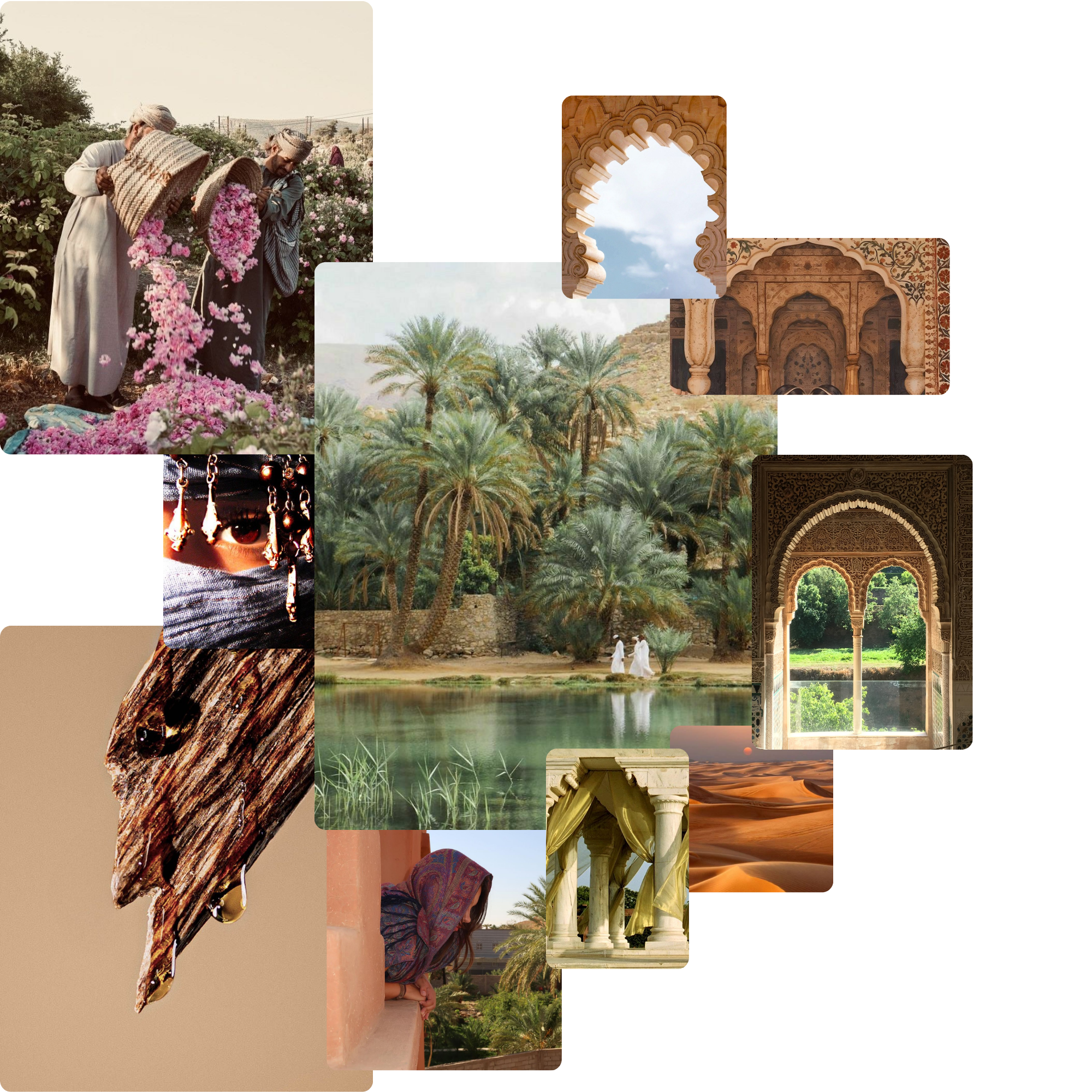
Early Concepts
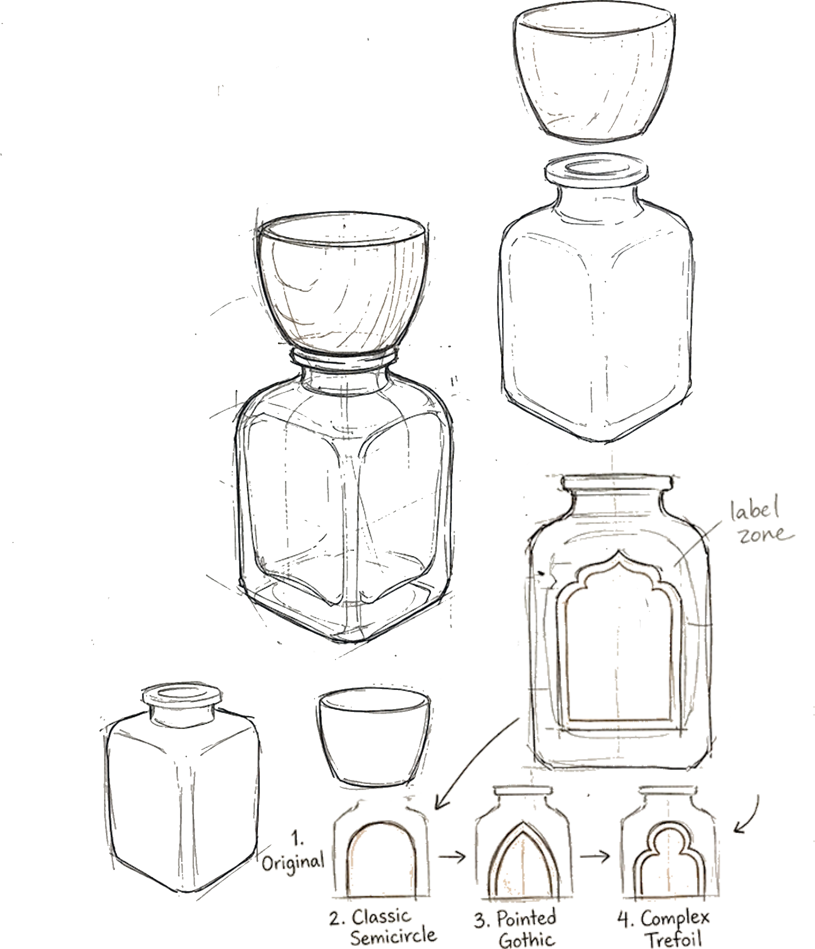
Form as heritage
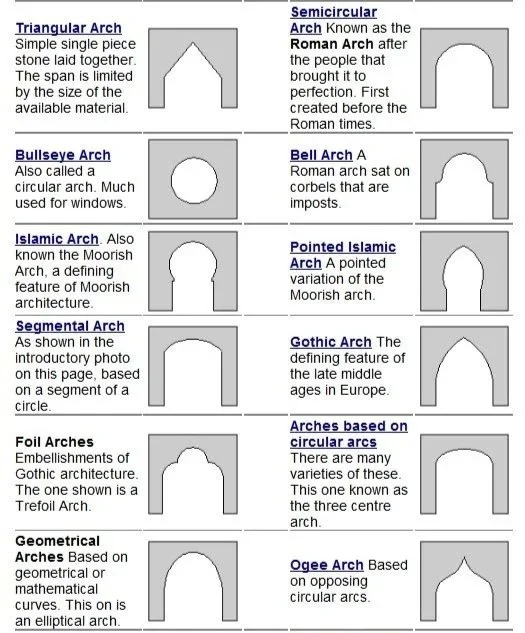
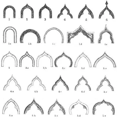
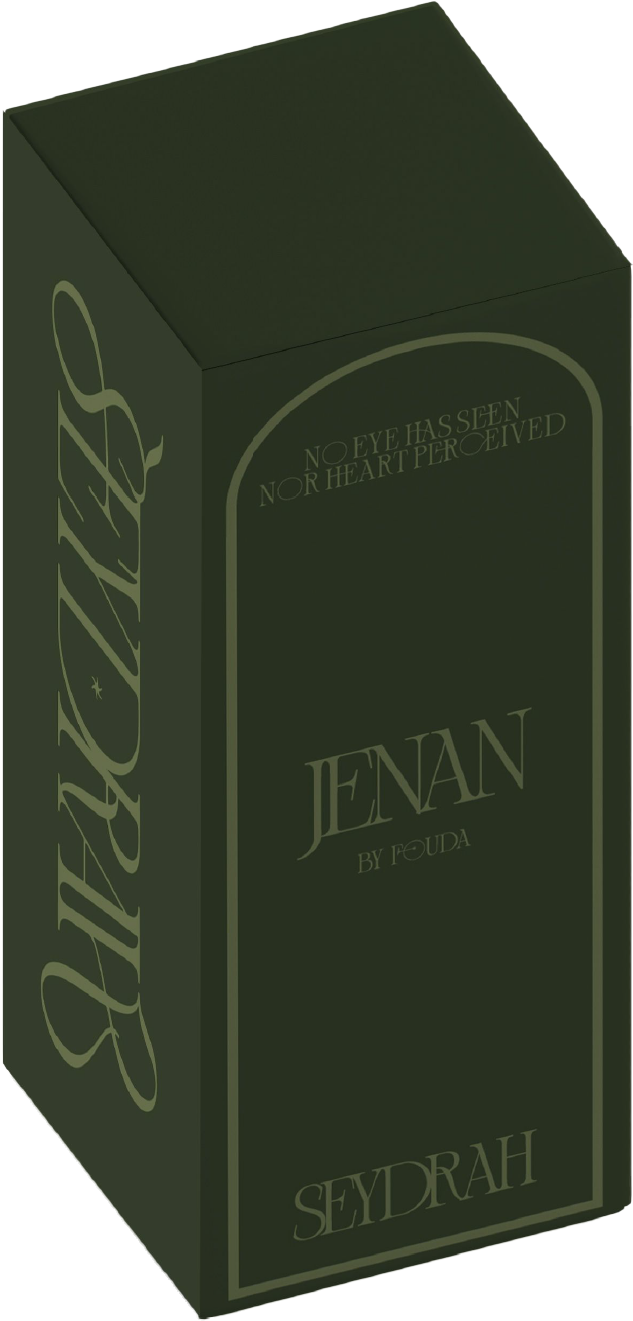
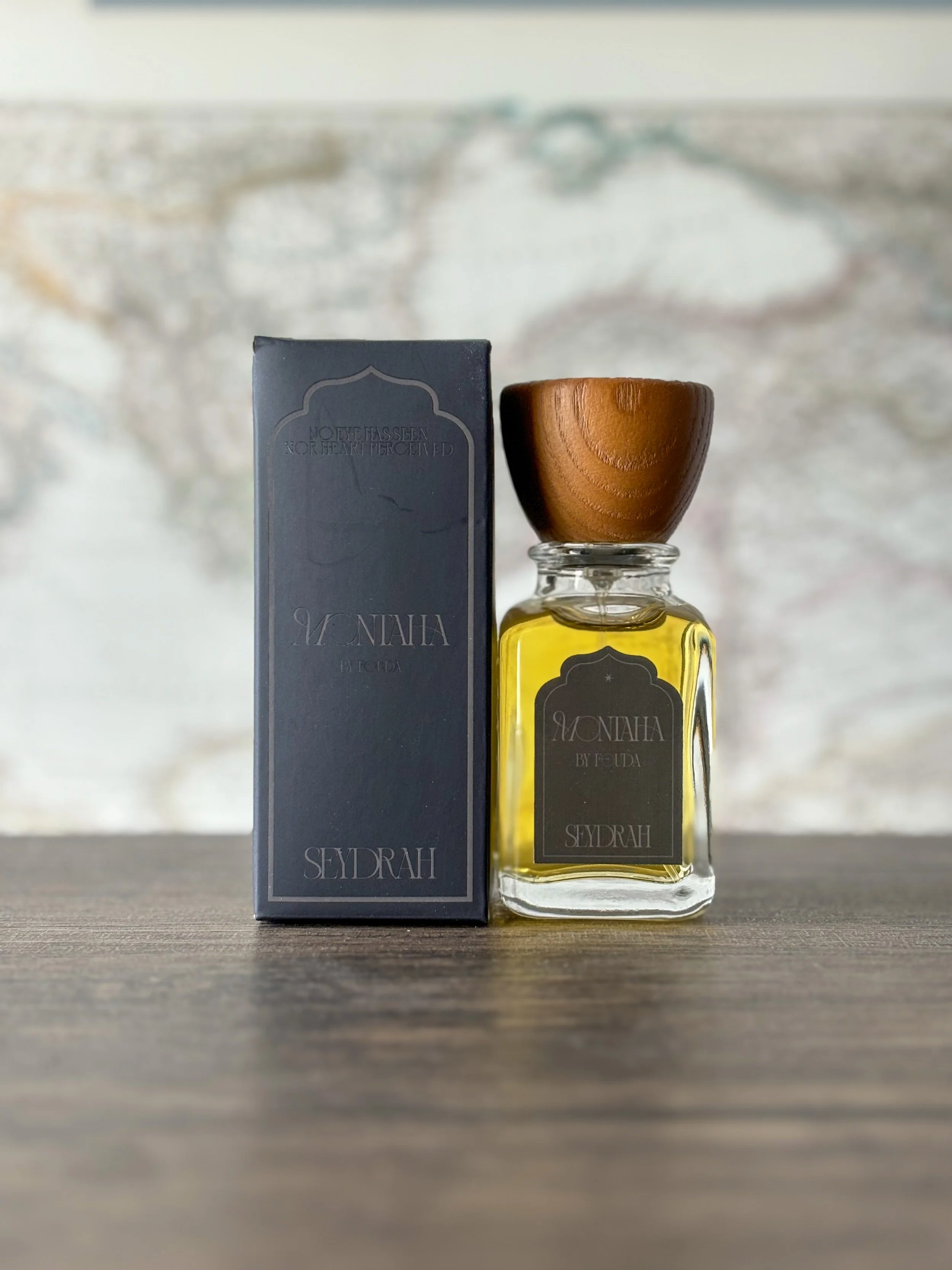
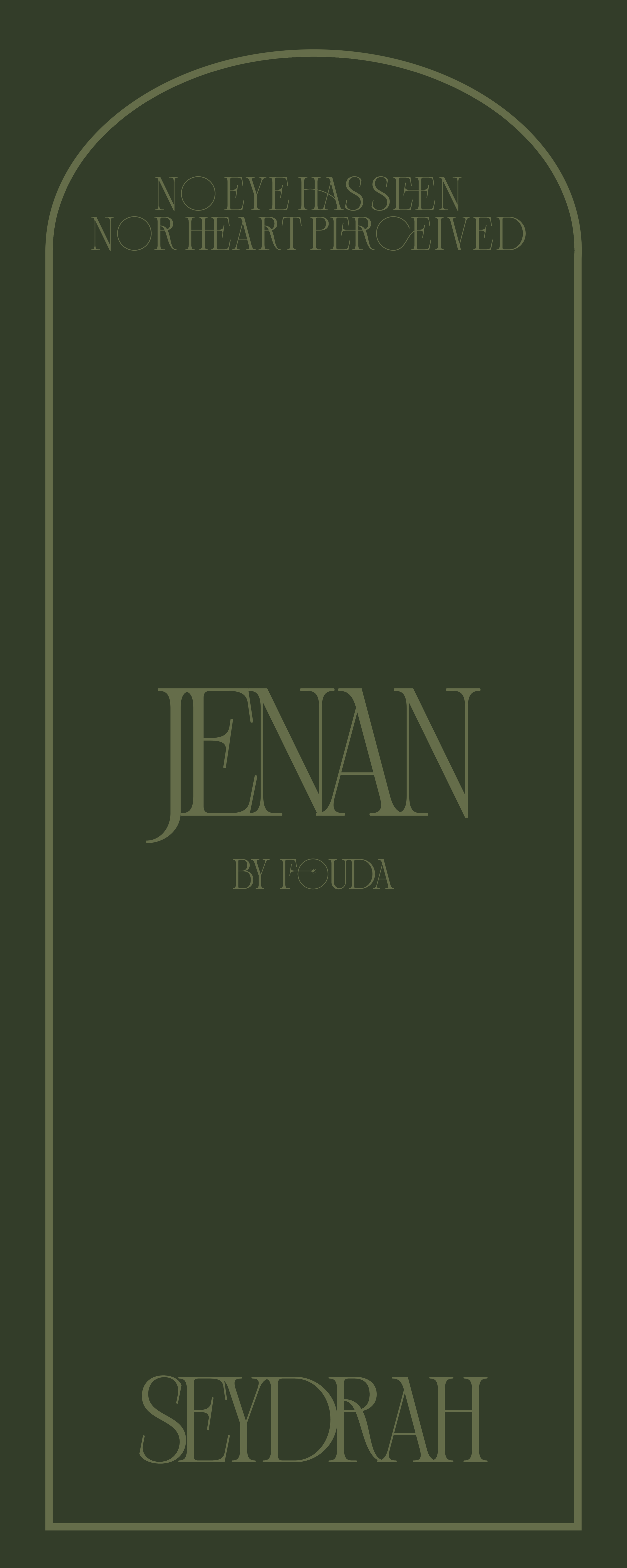
The bottles & accompanying packaging were predetermined. It was my job to understand how to adapt the brand story & create the visual language for its products. I found the bottle’s natural form played into Islamic style arches very well, & leaned into it.
I used different arches to anchor different scents for visual differentiation
Executing concepts- first boxes, labels, & type.
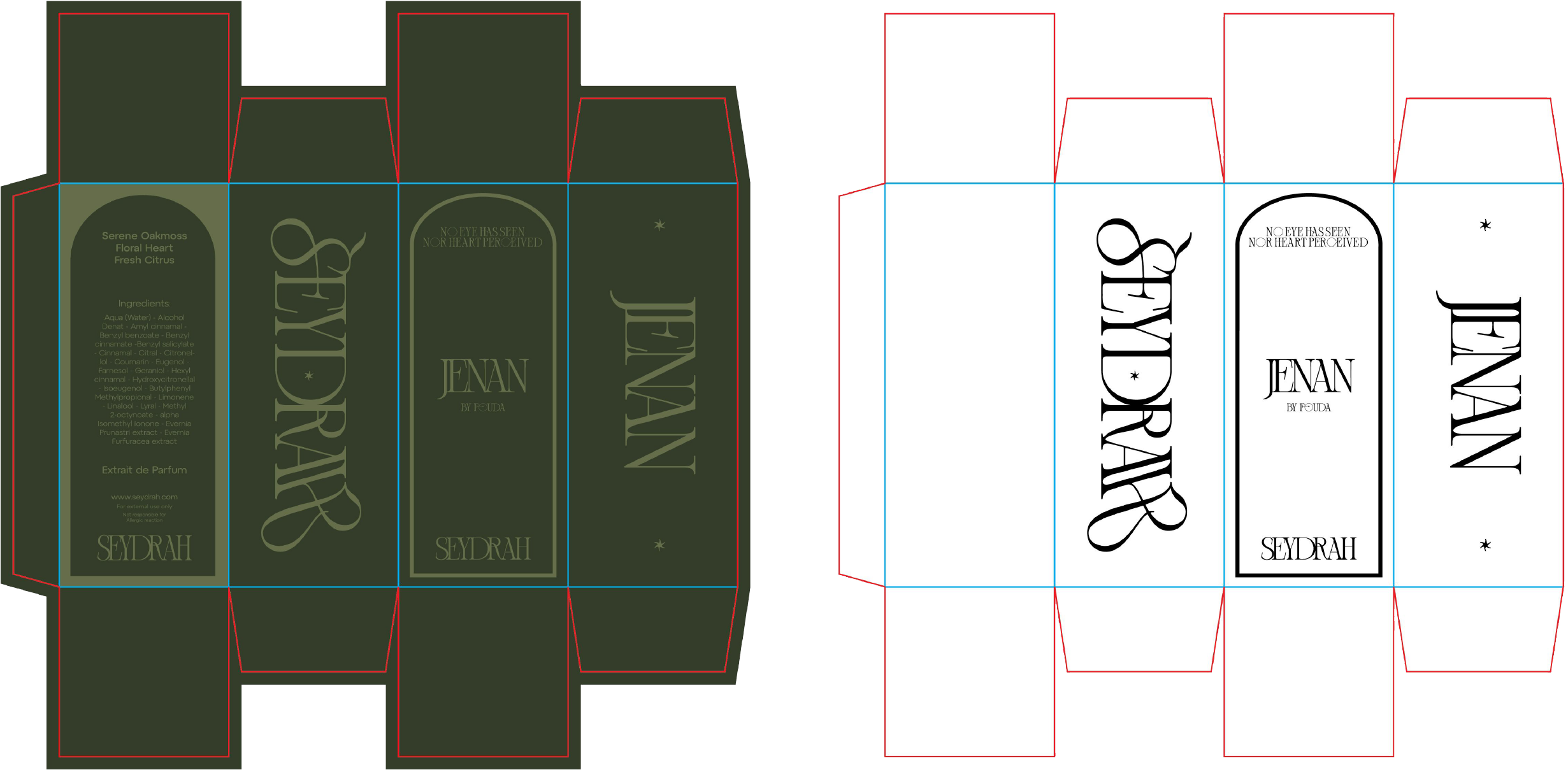
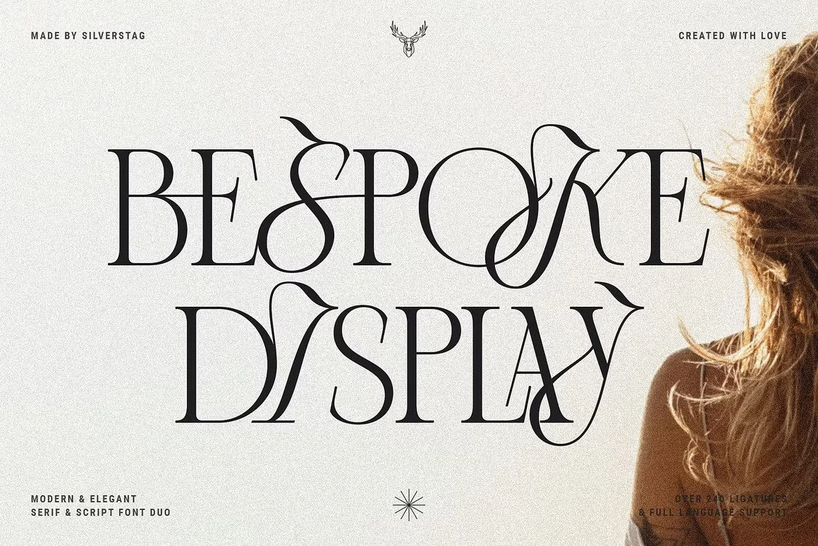
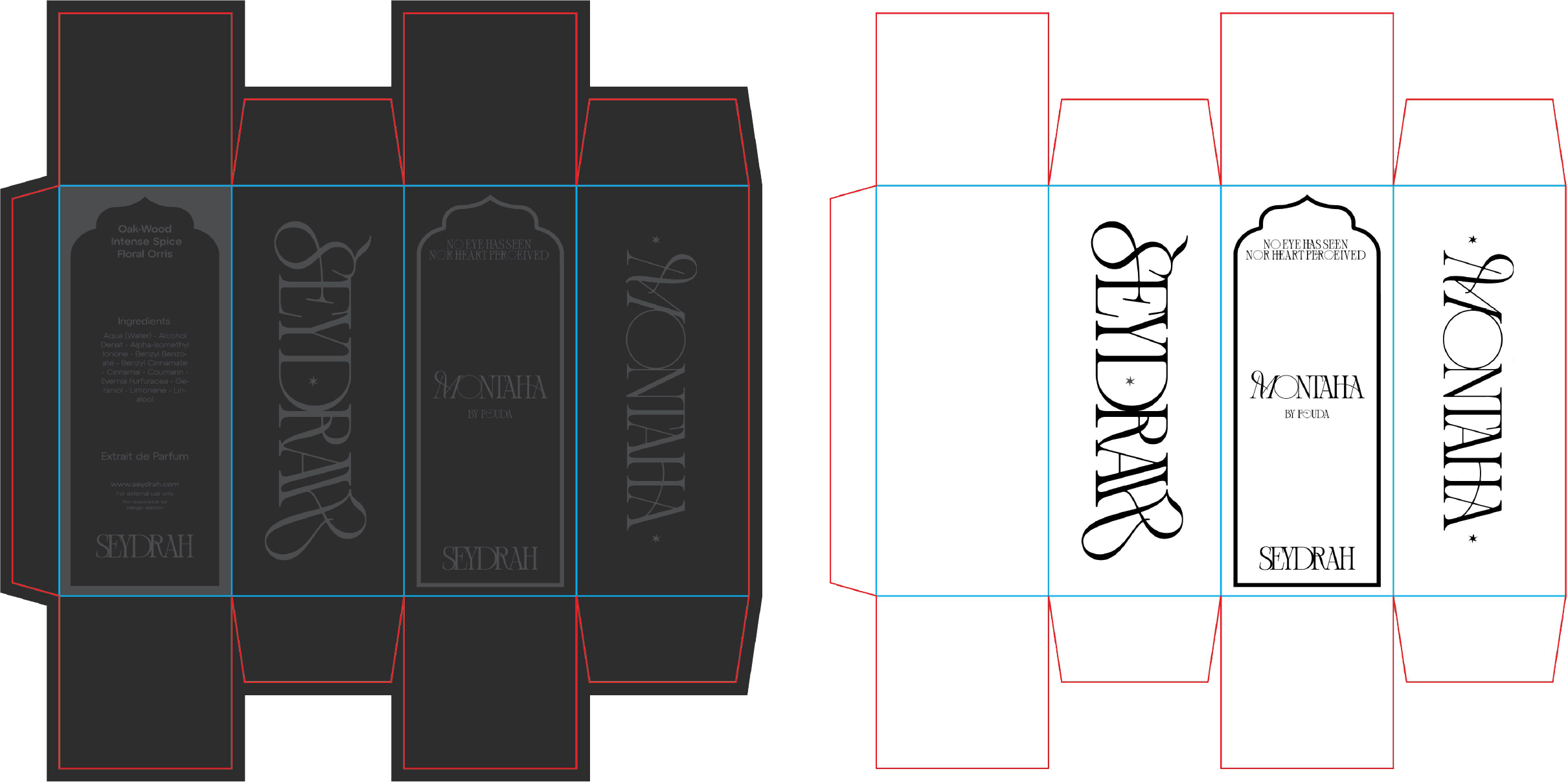
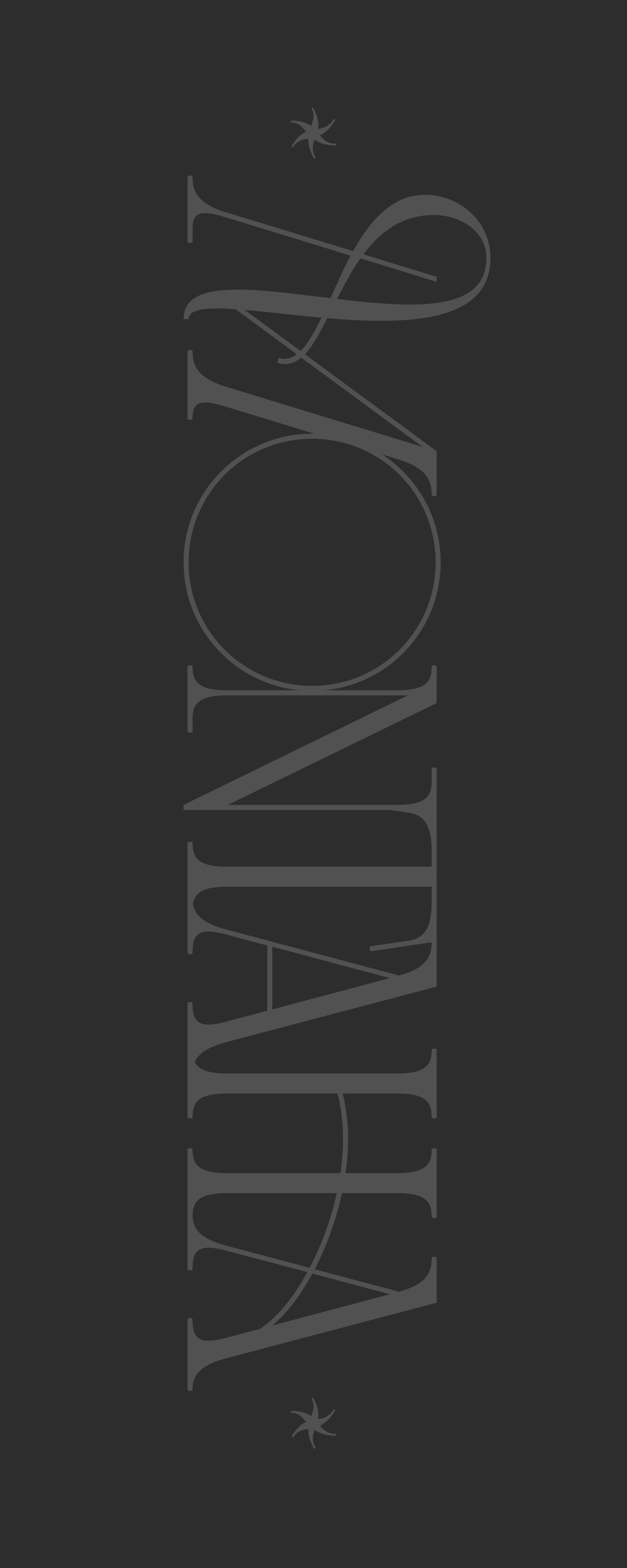
Bespoke Display was perfect to start with, balancing heritage serif with flow & expression reminiscent of arabic written language.
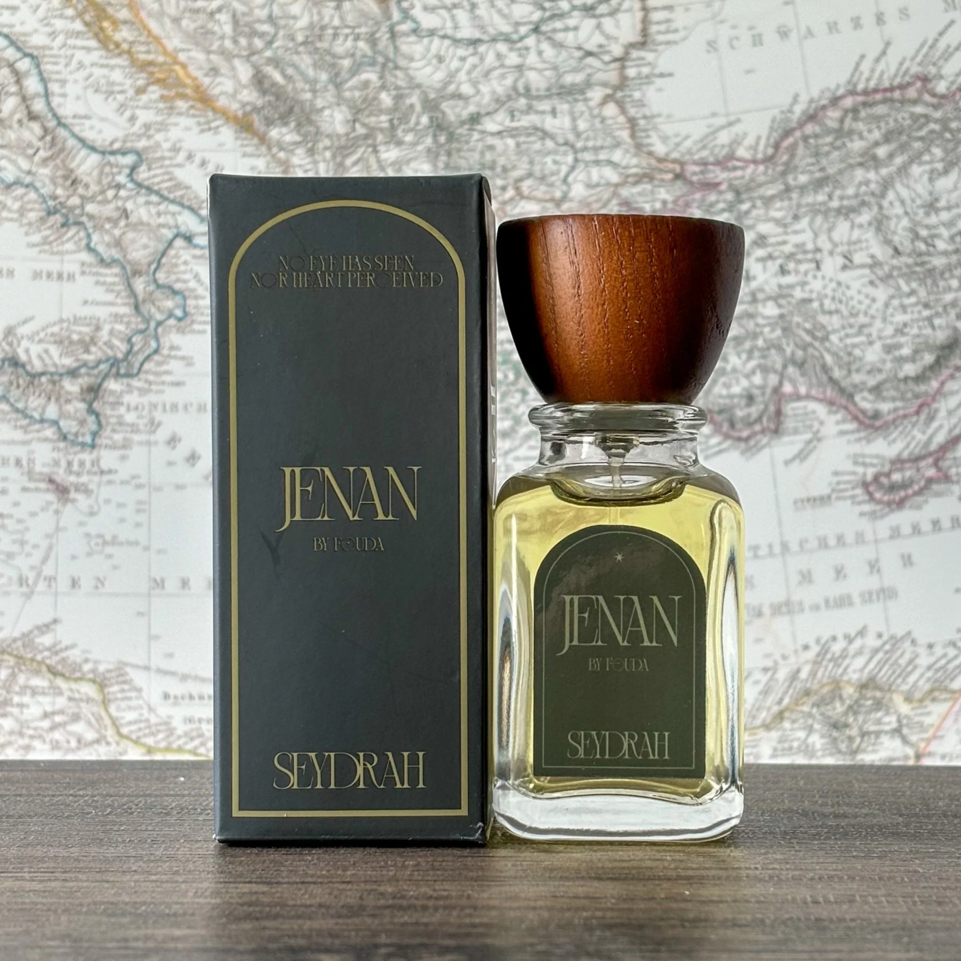
There was a rushed turnaround for this initial go, less than 2 weeks to create designs and get them printed from manufacturers. My takeaway after seeing this iteration was a better understanding of readability, color contrast, and font use.

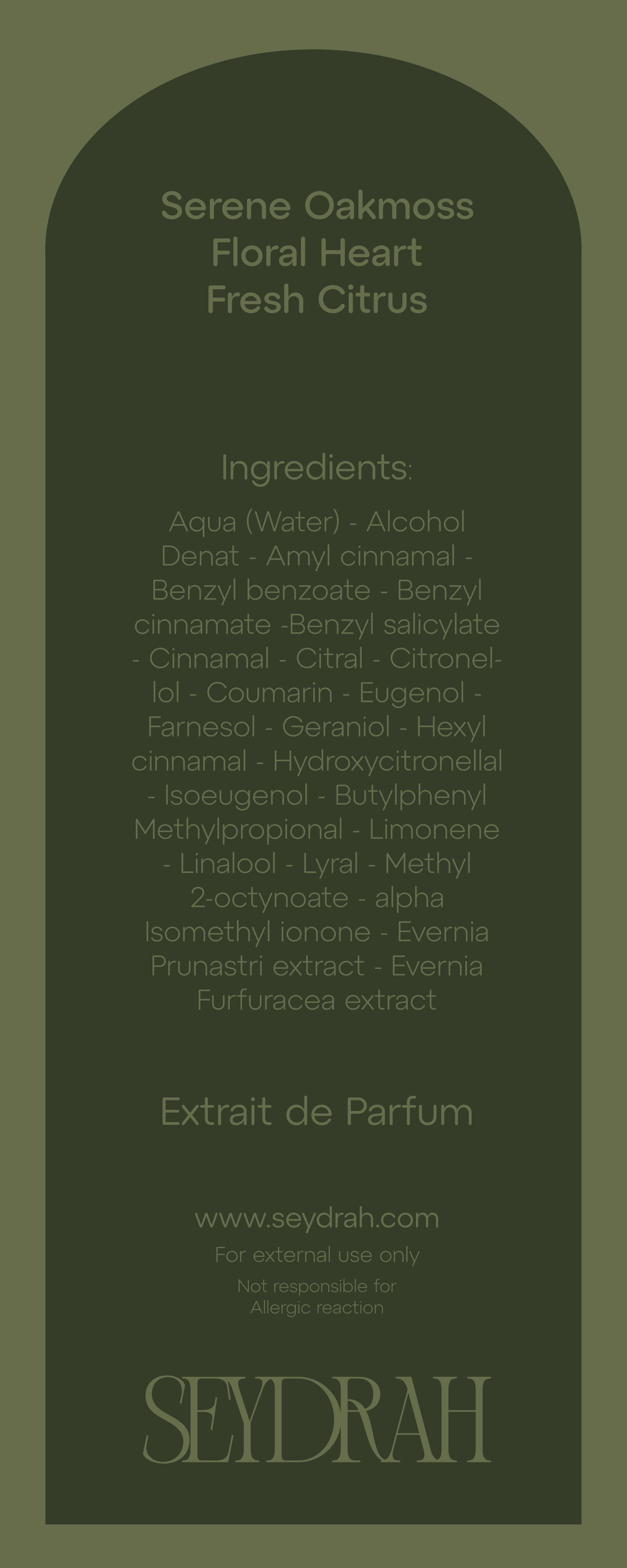
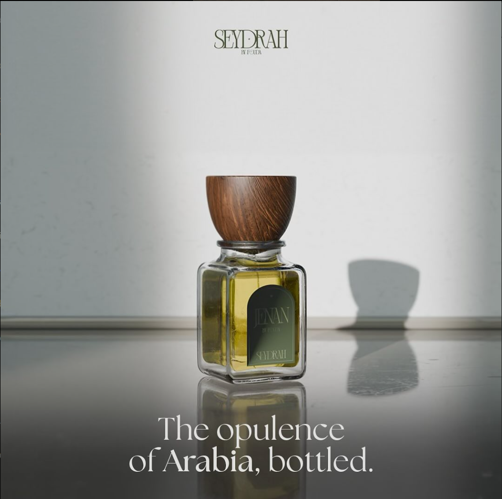
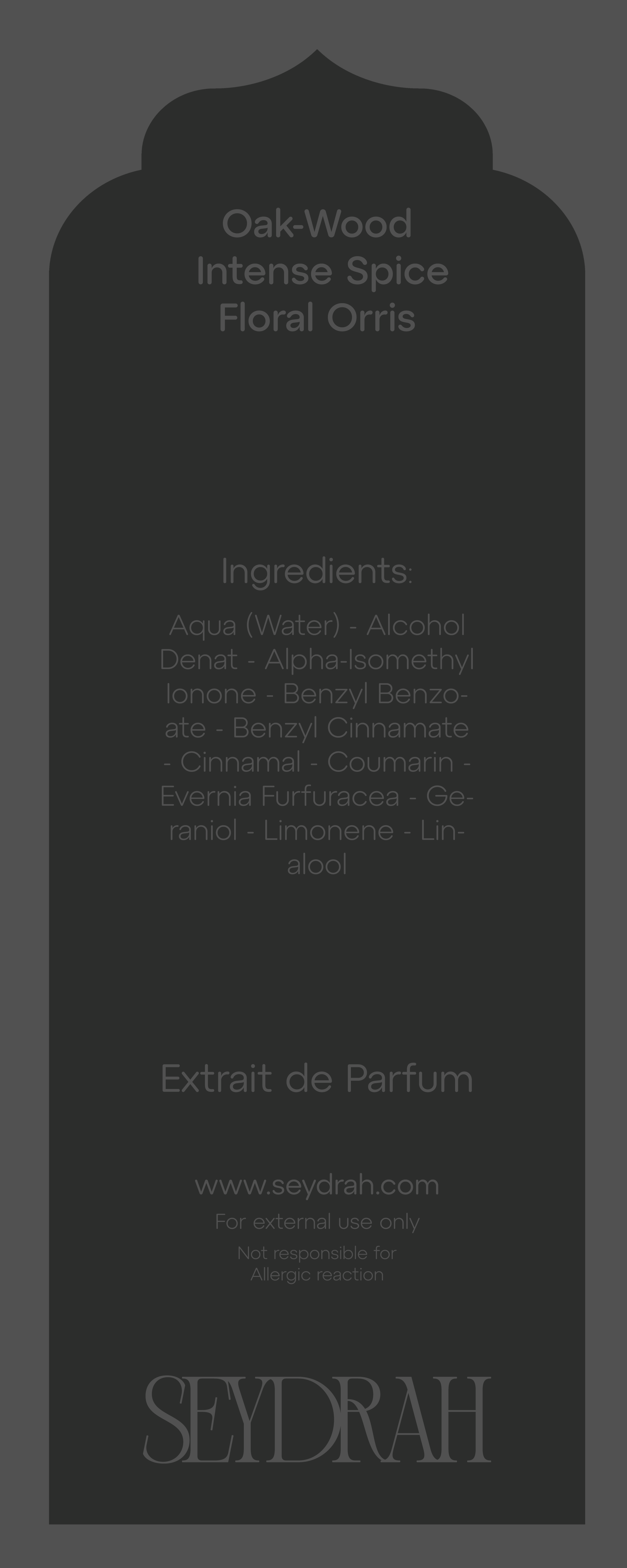
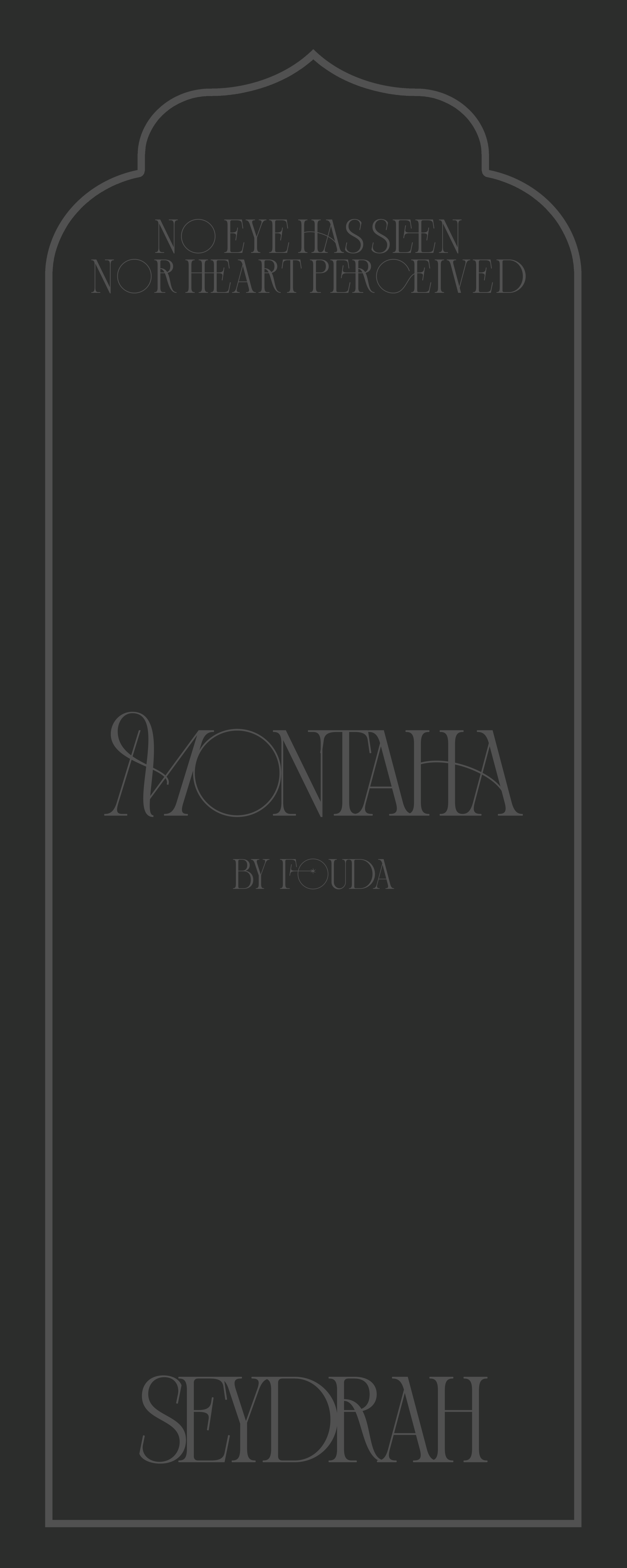
Final Form…
After analyzing the initial iteration, changes were made to elevate the luxury feel of the product, as well as improve the design for better legibility. A transparent version of the arch geometry and type was put in place of the original sticker-like label. Bespoke display was swapped for a similar, but more readable font. Overall, the intent was met: convey arabian luxury, heritage, and artistry through Seydrah’s fragrance offerings